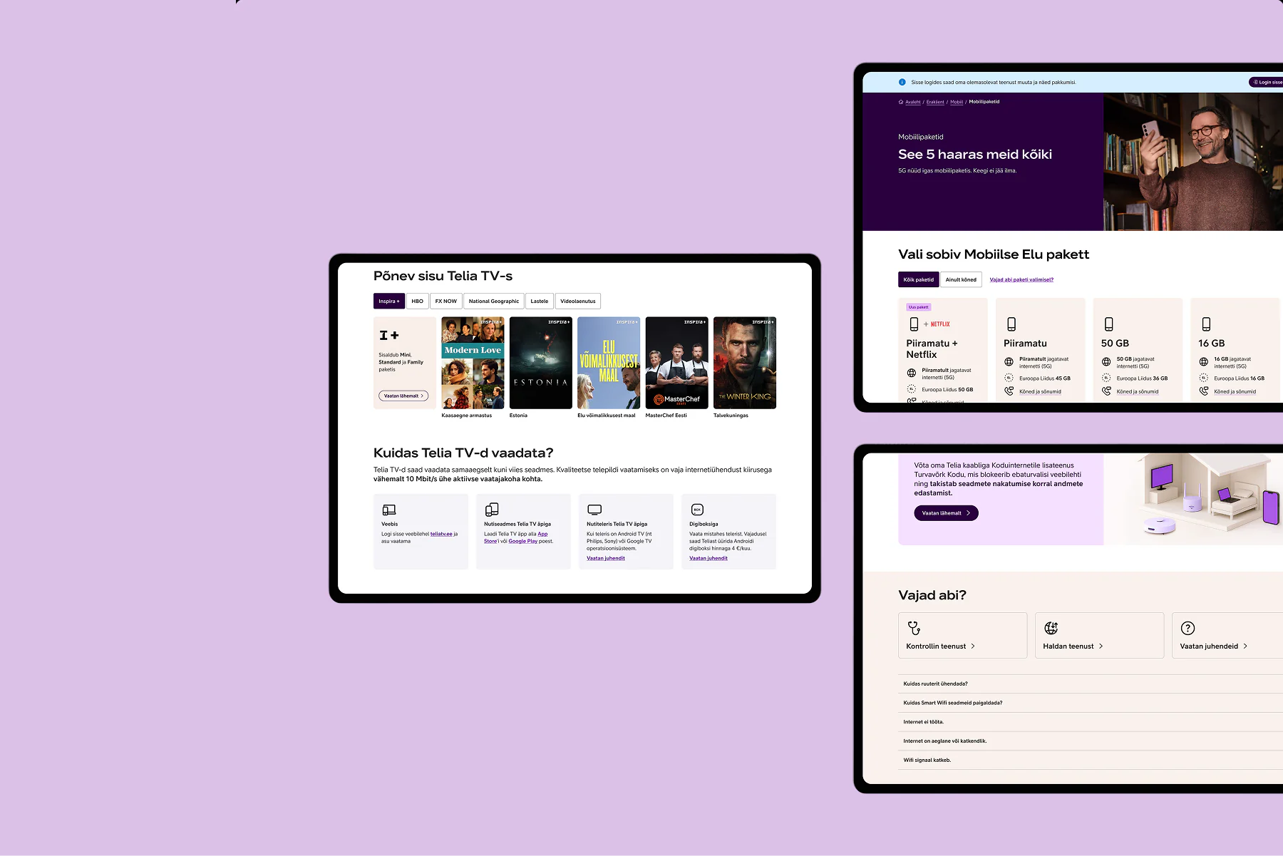
People had to start ordering to find the basics
Analytics and support feedback pointed to the same three problems.
Prices, devices and speed options were buried or inconsistent
Every service page was structured differently
Support kept hearing “I can’t find…”
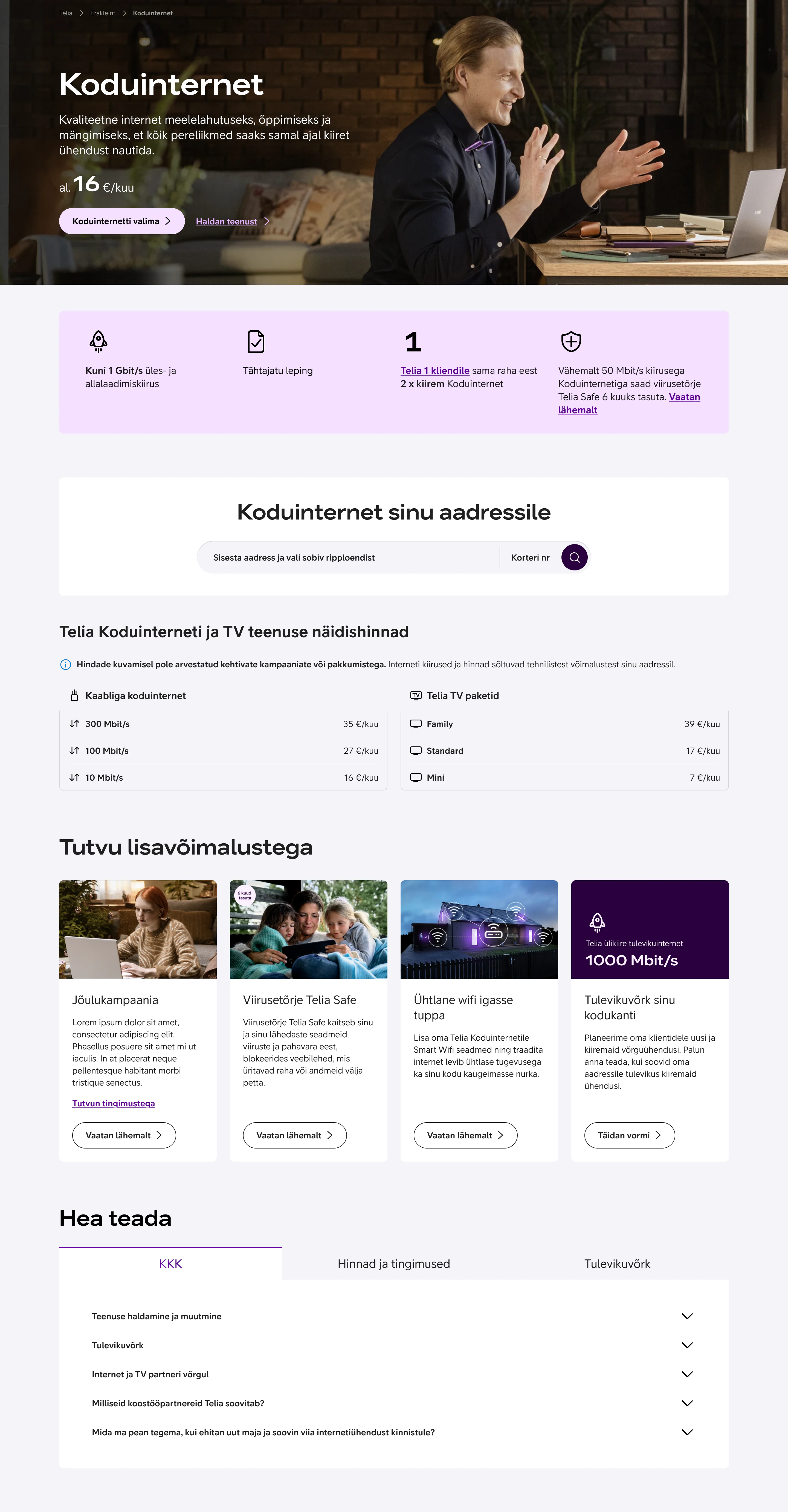
The old service page, scrollable.
The same order held across Internet, TV and Mobile
That consistency is what made one framework possible.
The most visited parts of each page sat at the bottom.
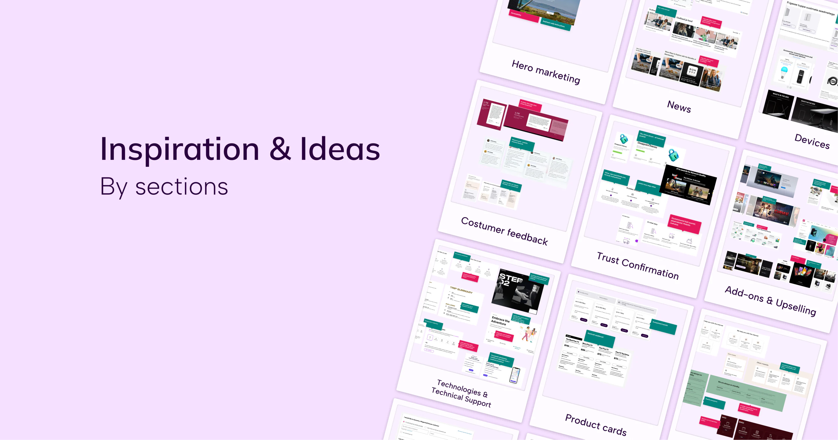
30 people sorted content sections into top, middle and bottom of the page.
| Content section | Top of page | Middle of page | Bottom of page |
|---|---|---|---|
| Hero section | 21 | 4 | 4 |
| Product cards | 21 | 8 | 1 |
| How to join | 14 | 11 | 5 |
| Pricing & terms | 13 | 8 | 9 |
| Devices for service | 7 | 17 | 6 |
| Telia 1 (next best offer) | 7 | 17 | 6 |
| Add Telia TV (promotional) | 4 | 11 | 15 |
| Better wifi (promotional) | 5 | 10 | 15 |
| Help & guides | 2 | 3 | 25 |
6 people, half on mobile, hunted for an offer. One change: the offer slot moved higher and became a personal next best offer.
A framework, not a one-off fix
One hierarchy on every content page: availability, pricing, features, support. Built so Phase 1 fed straight into the ordering team’s Phase 2 checkout.
Desktop was 60% of traffic. I pushed for mobile-first anyway: our mobile pages were broken, not unwanted. A year later mobile was 52%.
Before
- Complex navigation structure
- Generic hero messaging
- Scattered product information
- Unclear pricing hierarchy
After
- Streamlined user journey
- Clear value proposition
- Organized package comparison
- Prominent conversion elements
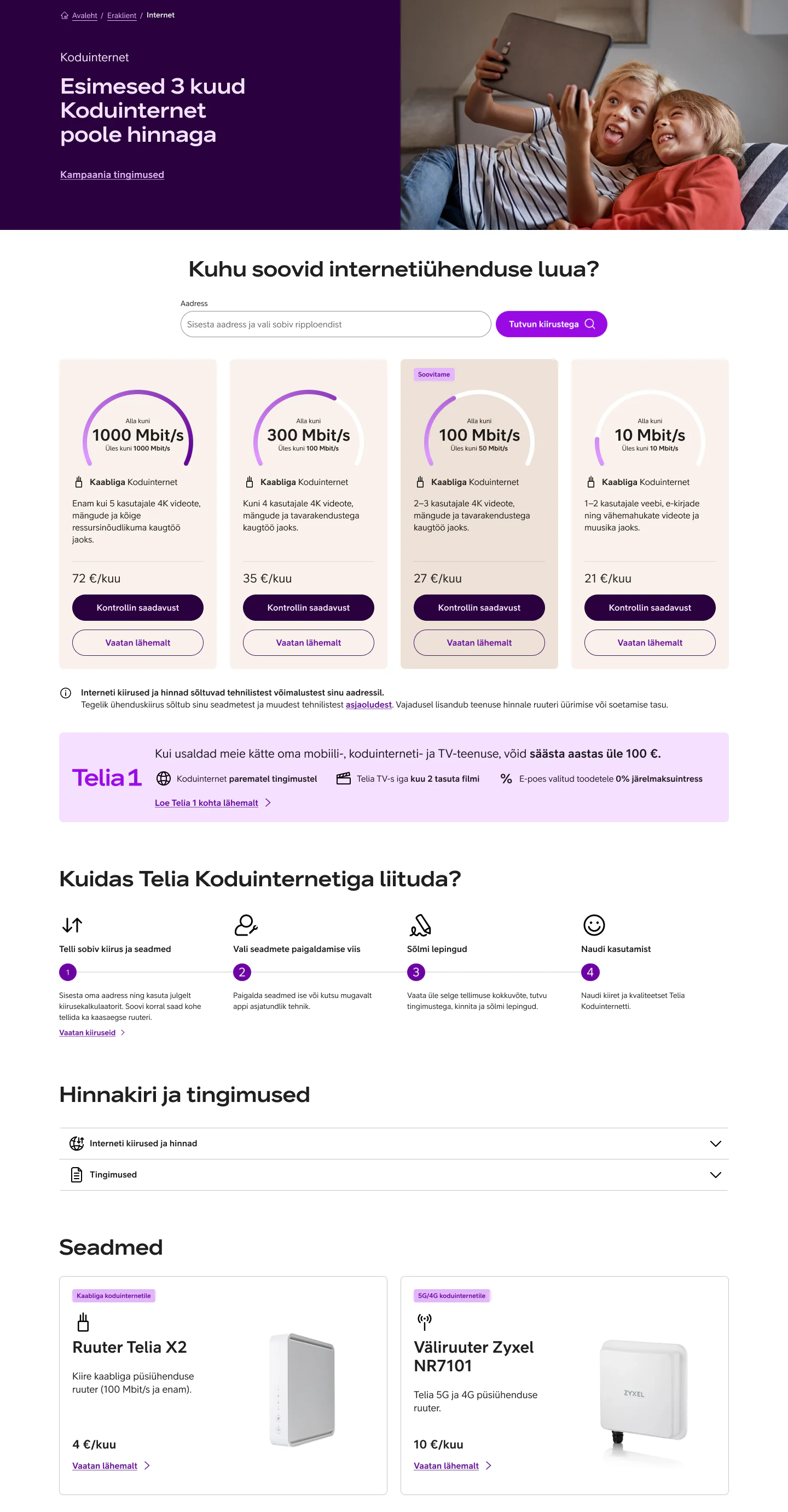
Content first, conversion follows
The new pages helped on their own, before the new checkout arrived.
Support teams reported a drop in “I can’t find…” calls. People were arriving at checkout already informed.
The framework became the standard for all new Telia service launches.
One audience was missing
We only tested B2C. Next time I’d include B2B.